Brand identity - Jukkasjärveri Destillery
An update of the Jukkasjärvi Spirits brand identity.
Summery
Client
Concept
Project Lead
My contribution
Packaging Designer
In group with packaging designers David Karlsson, Jimena Kimura and Daniel Axelsson.
My role & The team
Project type
School case study at Brobygrafiska with no collaboration with the client Jukkasjärvi Spirits.
Focus area
Graphic Design
Structural Packaging Design
Art Direction
Timeline
8 weeks
Anno 1858 & Premium
Background
Jukkasjärvi Spirits is a small distillery that has been producing spirits, beer, and non-alcoholic beverages since 2009.
Quality is a key focus, as the products are positioned in a premium price range and made with carefully selected ingredients.
The flavors of both the spirits and non-alcoholic drinks are inspired by local berries – such as arctic bramble, cloudberries, and blueberries.

The communication of Jukkasjärvi Spirits today is that they are a distillery with a strong history and local roots. However, their design does not convey this, nor does it evoke a premium feeling despite the higher price range. Their graphic identity across the entire range is also not cohesive.
Photos from Jukkasjärvi Spirits.
Challange
The re-brand
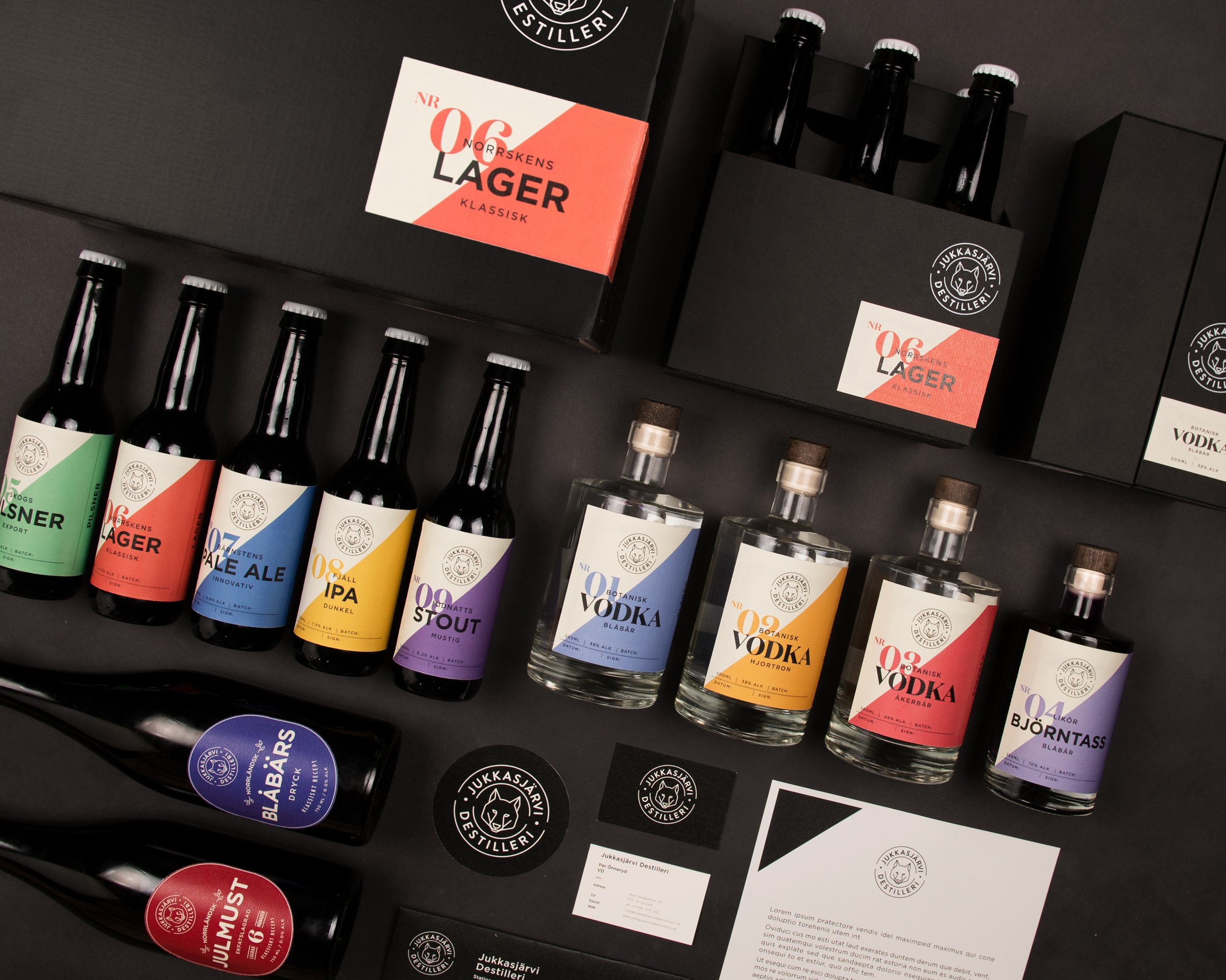
The design consists of a few strong elements.
To reflect the proud origins and the region of Lapland, we have worked with attributes found in the local environment – natural landscapes of mountains and forests.
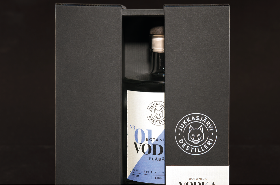
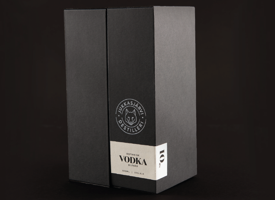
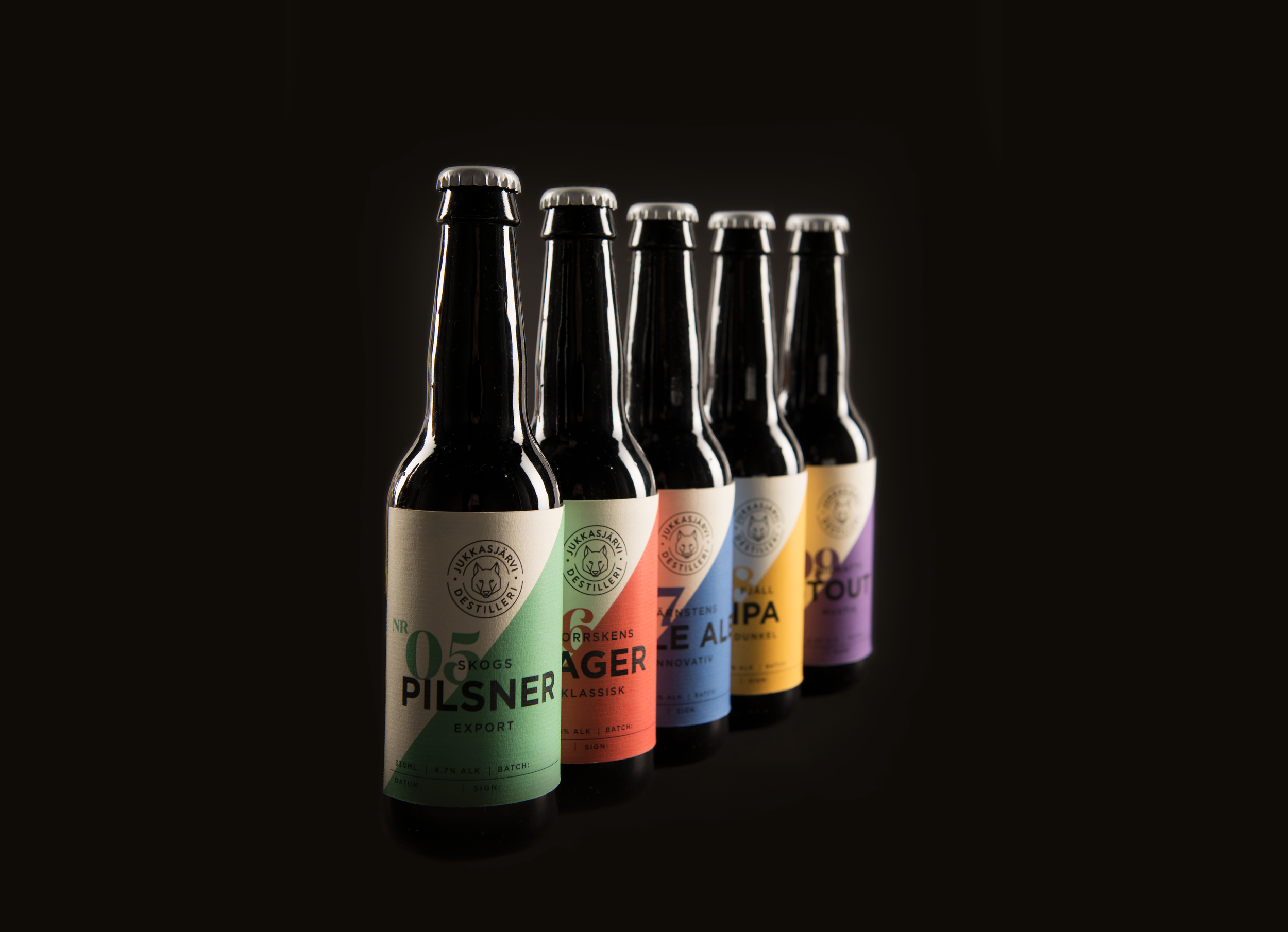
We used an abstract interpretation of a mountain on the products. Each bottle features a diagonal shape representing the left slope of a mountain. Together, the bottles form an entire mountain range.

The typography is carefully selected and adapted to balance both emotion and functionality.
We want the company to feel honest and traditional – but not outdated or old-fashioned. By combining our three chosen typefaces, we’ve created a balanced visual expression that captures this feeling.