
Willys accessibility in e-commerce
Rebrand of Willys’ e-commerce in the app.
Research was conducted on both the physical store environment and the digital platform. The focus was on accessibility adjustments to navigation, text, and visual elements.
User testing was carried out with participants from the target group with cognitive impairments.
Summery
Willys
Client
Focus area of UX
UI-design, Universal design
UX-Designer
In group with UX-designers Karin Bodin, Caroline Olinder, Maja Lagerkvist, Safiya Reitz.
My role & The team
Research of physical location
Interviews and testing
Prototyping
UI design
My contribution
Timeline
5 weeks
School case study with no official collaboration with the company Willys.
Mentor by the organisation Our Normal and agency Studio Berget.
Project type
Background & challange

How accessible are grocery stores?
This was the brief from Our Normal and Studio Berget. The organization Our Normal works with creating meeting places for families with children who have cognitive or physical disabilities. The service design studio Studio Berget also took part in the project.
Through our research within the framework of universal design, we analyzed both physical grocery stores and e-commerce.
Based on the most prominent areas for improvement, we chose to focus on Willys and their app. There, we identified several issues in the user interface, particularly regarding size, color choices and design

Which grocery store has the greatest potential for improvement?
By applying Jakob Nielsen’s 10 Usability Heuristics for accessibility, we conducted research on the three largest grocery store chains in Sweden: ICA, Coop and Willys.
Some of the questions we asked ourselves:
In the physical store – is everyone included, such as individuals using wheelchairs?
In the online store – is it possible to navigate using the tab key, and can blind users access content through features like ALT descriptions on images?
Key insights:
Willys’ e-commerce app showed the greatest need for improvement.
What do the users say of current mobile platform?

Seeing the greatest need in the Willys app, we interviewed and observed individuals with cognitive disabilities to understand their experience with the e-commerce features.
”The buttons are too small, I become unsure if I have pressed correctly or not.”
”Text too small, only the price is visible.”
”Too many graphic elements demanding my attention, and each step makes me tired.”
Key Insights:
Plenty of improvements to work with the interface.
The main issues highlighted by the users

Poor contrast
Unclear price tags & misleading colors
Small labels (keyhole, KRAV-labeled)
Excessive amount of text
Cramped impression
Difficult navigation of nav and tab bars
No hinting/feedback
With all these insights, it led to the question:
If we adjust contrast, size and hierarchy according to WCAG and user feedback, will the interface be more accessible for everyone?

Prototype & Iteration
We did a deep dive into creating a high-fidelity prototype because the interface was easy for us to copy and create in Figma.
We didn’t create any low-fidelity prototypes as we decided that the fastest way to iterate with test users was for them to see the prototype on their own phone, scrollable and clickable.
Our solution - the overview
Our solutions- details

Hierarki & navigation

Generell layout - Space & Contrast

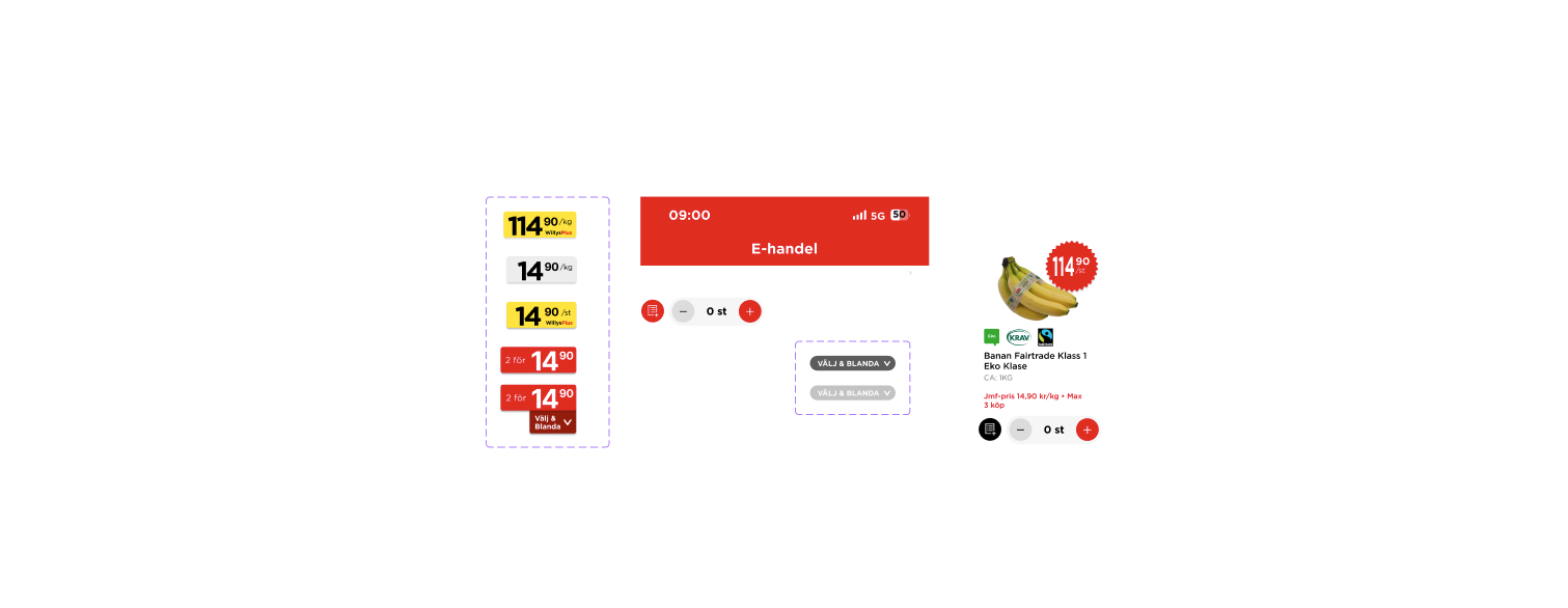
Original Price card - color & size changes
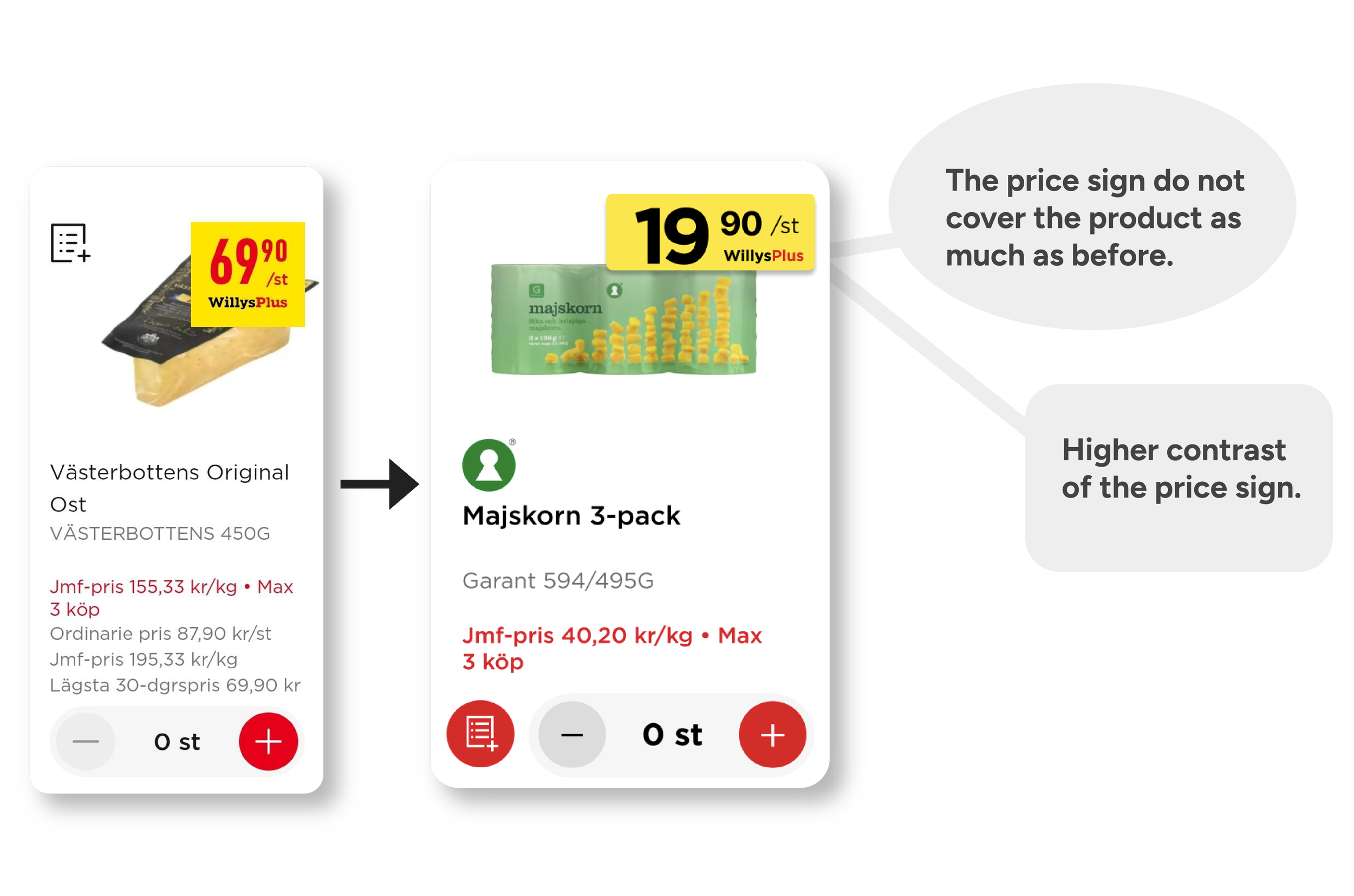
Member Price card - Don’t cover photo & higher contrast

Reduced Price card - More visible elements
Iteration - What do the users say of our changes?
Cognitive observation with the same 10 individuals as before.
”Clearer that the shopping list is a button now than before when it blended into the picture. It’s not as cluttered in design anymore, feels calmer for the brain.”
”Great that you’ve simplified! Before, there were 10 things to keep track of, now only 5”
”The signs stand out, and you quickly notice that they are different, in terms of shape, color, text”
Key Insights:
Great feedback. We did also recieve some things to improve which is stated below.
Reflection & what could have been differently

Short time
Done a second round of iterations.
Add more hinting and feedback on buttons.
The button “Mix and match” did we receive most negative feedback on in the iteration. We got input about that it could have been a pop-up window.
Inplement darkmode and present it in the iteration.
Long time
Setting to read out text to include people with severe visual impairments.
Check so the whole mobile platform follows the law to bring Willys up to speed - WCAG 2.2 accessibility perspective
Could red be changed on certain elements? Hard color to work with