
Motala Kommun - Accessibility analysis
Accessibility analysis in the form of a 62-page presentation created in accordance with WCAG 2.2 guidelines, focusing on aspects such as contrast and navigation to ensure usability for all. Both desktop and mobile devices were reviewed. The analysis focused solely on visual design, not on code.
Summery
Client
Focus area of UX
Accessibility
UX-Designer. In group with UX-designer Liza Blomqvist.
My role & The team
Analysis of navigation
Analysis of information hierarchy
Analysis of text
My contribution
Timeline
2 weeks
Project type
Consultant assignment at Consid
Background & challange
Motala Municipality wanted to stay up to date with accessibility in light of the new WCAG 2.2 guidelines coming into effect in 2025. Therefore, they reached out to Consid for assistance with an analysis of their website.

Which pages were reviewed?
Since Motala Municipality’s website contains a large amount of content and we were working within time constraints, a selection was made to prioritize the review of the most important pages.
Start page
Menu
Search
Selected content pages

Below are some examples of pain points and solutions.
Please contact me to access the full 62 pages accessibility review.
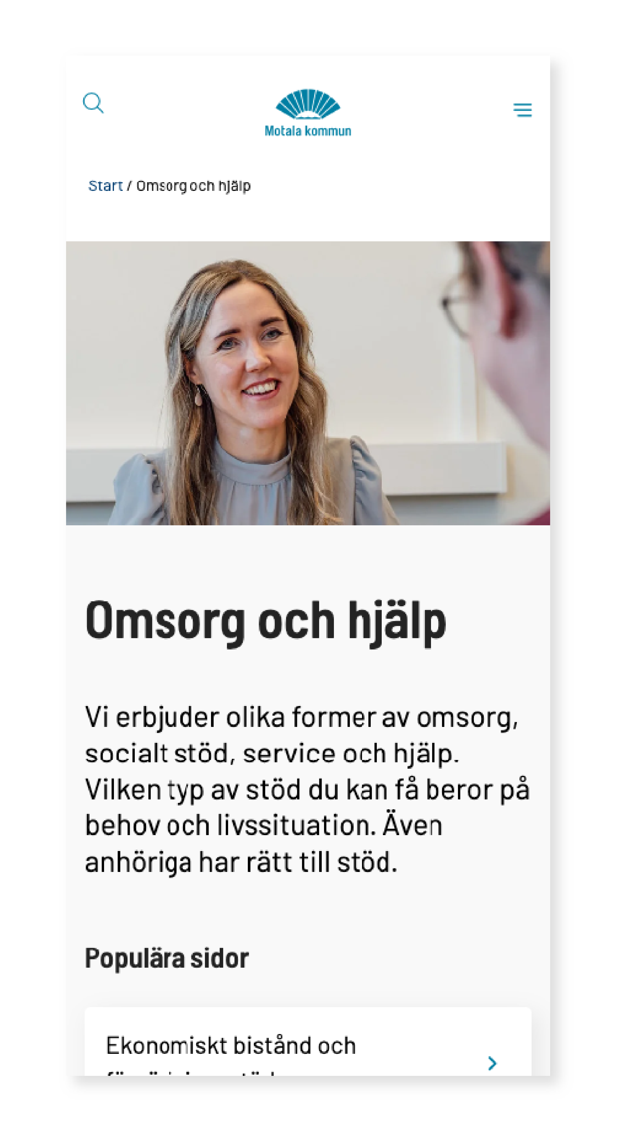
Lack of breadcrumbs in the current design
To help users understand where they are on a website, breadcrumbs are needed to show their current location within the site structure. This feature was missing at the time of review and we suggested two breadcrumb design options that could be implemented.
Current design

We proposed two breadcrumb options, one of which was implemented.

Service messages – are they important for everyone to see?
Service messages link to current municipal updates, such as road closures or water supply issues. At the time of review, these messages were placed in the header — an area where users typically expect to find only the menu and search bar, to maintain familiarity with standard header design. We recommended moving the service messages lower in the hierarchy, placing them below the search field.
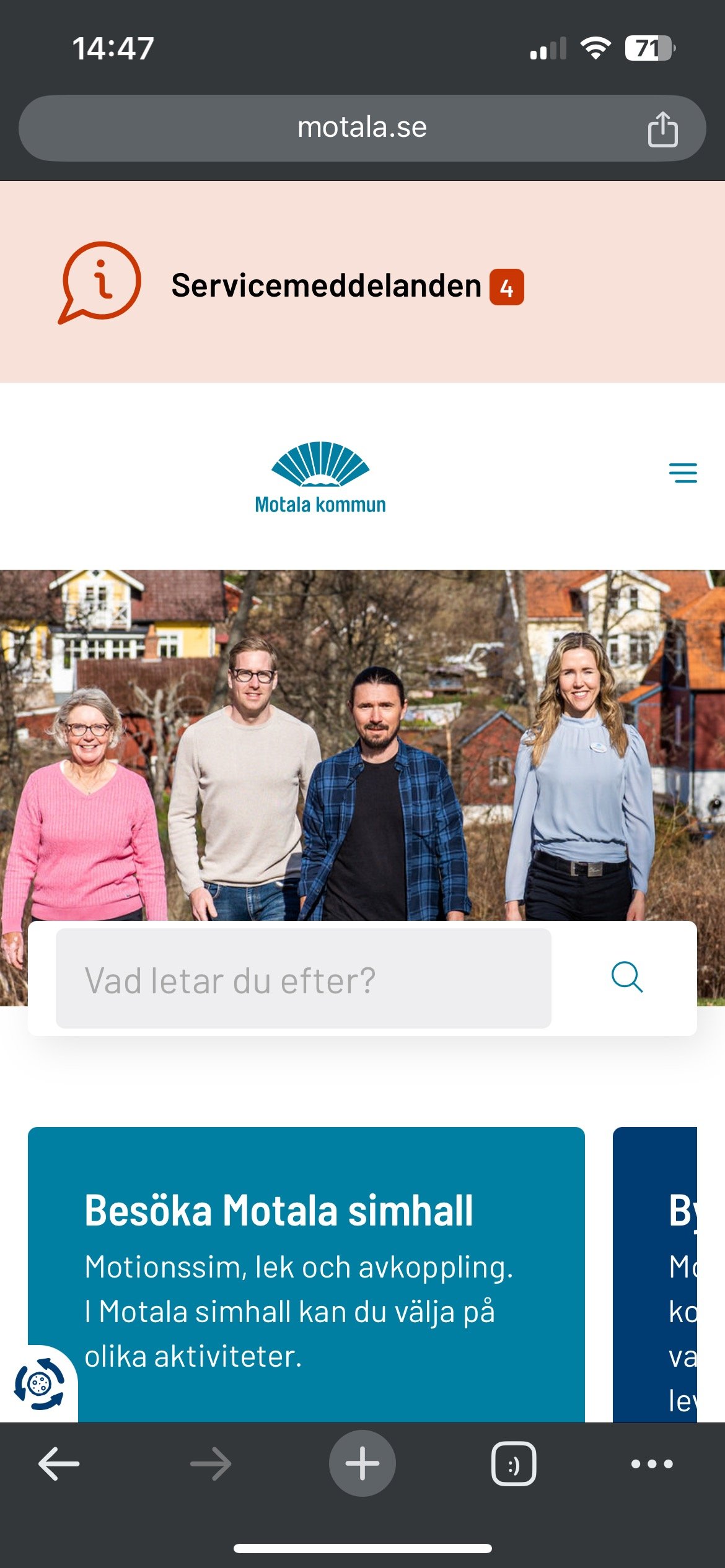
Current design. Service messages in the mobile header.
Our suggestion was to move them further down in the hierarchy for better usability.

Inconsistent link design – default state vs hover state
During the review, we identified several inconsistencies in link styles — such as variations in color shades, arrows, and underlining — where visual indicators lacked a unified logic. This can create confusion for users and reduce predictability within the interface. To enhance user recognition and simplify navigation, we recommended that all links follow a consistent visual standard.
Current default state


Current hover state
Our suggestion for the default state was to remove the underline, as it can be mistaken for a previously clicked link.

The hover state retains its color change from white to blue, as it's important for the user to see that a change has occurred. The underline is also kept, as it serves as a visual indicator of interactivity.
Cards, links & buttons
We did discover the inconsistent on more cards, links and buttons which we also presented.

Feedback and future implementations
The accessibility analysis was presented to Motala Municipality in November 2024. We received valuable feedback; they agreed with several of our points, many of which they had already discussed internally, as well as some new insights they had not previously identified.
Our analysis is part of a larger investigation of planned improvements.
As of May 2025, several of the suggested changes have been implemented — for example, breadcrumbs.